Szenerie
Lars Breuer, Hannes Norberg, Thyra Schmidt
4 April – 18 May 2025
Kunstraum Pempelforter
Schloßstraße 65
40477 Düsseldorf
Germany
 In April and May 2025, the exhibition “Szenerie” (~ Scenery) in the Kunstraum Pempelforter, Düsseldorf, Germany, united three artists with different approaches: Lars Breuer, Hannes Norberg and Thyra Schmidt. During their studies Lars oriented to painting, Hannes and Thyra to photography. Nonetheless, all three deal with scripture in their work. In consequence, this was the point of departure for the exhibition. Though, they did not content themselves with this commonality. Another clamp which united the works was a colour concept for the exhibition space.
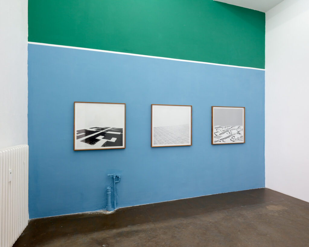
Beside the white wall facing the entrance, the others were painted in light blue and muted green, accentuated with white skirting boards. In each case, one colour took up the lower part and the other the upper part. At the opposite wall the colours were reversed. This emphasised the works presented on different backgrounds. Moreover, the design connected them and created a common stage, the “Scenery”.
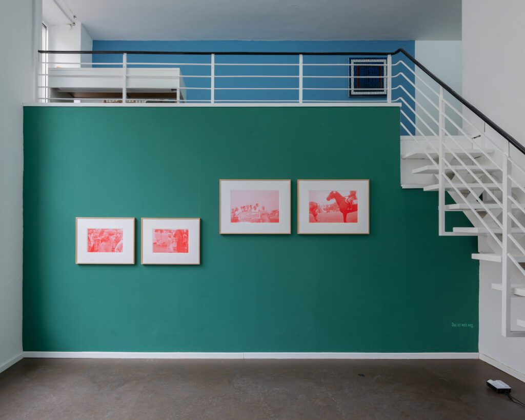
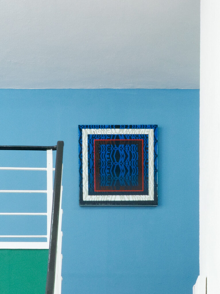
 Thyra’s installation “IHR” (YOU), four reddish handmade silkscreen prints, and a video projection were highlighted by the complementary and the light-dark contrast to the muted green. Hannes’ black and white photographs of typographies from his series “Upper & Lower Case“ appeared even more analytical on the cool blue. Lars’ site-specific work “Wahrheit” (Truth) took up the two background colours on white ground. Two related paintings “Wahrheit” and “Wirklichkeit” (Reality) picked up the blue of the walls of the gallery above the main space. The one in darker shades is placed on blue ground. Whereas the other one kept the light blue, but was presented on a white one.
For “IHR” Thyra transferred sections of found private photographs to silkscreen prints. The rasterised pictures show convivial moments from 1958 in Schleswig-Holstein, Germany: disguised children during a street parade; people posing in and around a cabriolet and a horse race. These relaxed moments in a Germany during the Wirtschaftswunder (Economic miracle) are contrasted by a text-based video projection downright. It is a fragmented dialogue, written by the artist. Yet it remains uncertain, who is speaking and if it is an actual situation, memory or an imagination. Sentences like “You’re trembling”, “No fear. Cold water” or “Many are missing” give the impression of a disagreeable, uncertain or even dangerous situation. The contemplator might interpret a remembrance to passed circumstances of the war, recordings of a conversation during a flight into the past or contemporary or recall a personal experience.
 Hannes’ series “Upper & Lower Case“ shows enlarged samples of typographies, which were arranged in space and recorded in natural light. He titled this work after geographic places. This could be cities (Ouro Preto) or quarters (Oberbilk, Yongding), regions (Al-Andalus, Kansai) or street names (Piccadilly, Sonnenallee). They indicate the origin of the typographies, or the pictures recall the sites. For example, one might remember the lively Piccadilly Circus contemplating the photo with the title of this street in London. Sonnenallee, with its with huge, bold letters, might be a reminiscent of ground plan of Berlin’s historic tenements (Mietskasernen), with its consecutively build courtyards. Al-Andalus shows Arabic characters on a mildly undulated sheet, which could make think of a hilly terrain. Hence, the reference to the Arabic name of the area of the Iberian Peninsula, Muslim-ruled between 711 and 1492. The artist transforms abstract graphic characters on paper into images. Herewith, they get a new life and form landscapes or urban environments. It is an invitation to a journey in space and time, where the traveller gets an orientation by the graphic characters, the visual language and the title.

 Lars also creates images in using letters. However, he applies whole words on walls or canvas in his self-developed typeface. They are not incidental chosen terms, but concepts. For his wall painting “Truth” he repeated and reflected the German word. In consequence, it was hardly legible, though it formed an ornamental, vertical pattern. The actual term vanished. Could it be an allusion to the fading significance of truth considering the increasing number of fake news? A glance to the two pigment/lacquer paintings on canvas on the gallery, seem to confirm this observation or critique of society. Despite the poor contrast between black and dark blue or respectively white and grey, the word “Truth” in the upper image area is relatively good legible. Though the term dissolves almost entirely in the red framed picture centre. Whereas the German word for “Reality” appears faint with its light blue letter fragments on white ground. Does this painting illustrate the existence of various realities due to different perceptions and access to information? Do the three paintings refer to the difficulties to recognise the “real” facts at the sight of many alternative truths and realities?
Photos © Thyra Schmidt & Hannes Norberg
Text: Astrid Gallinat
